Hi everyone!
I've had this post saved as a draft for a long time, and have daydreamed about sharing it, and I can't believe we're finally here! I've more or less been working on the new look since I started as Ravelry's product designer in January of 2019. When the team (Cassidy, Jess, Mary Heather, Sarah, Christina, and I) talked about it in the early stages, we discussed two big reasons for making the change:
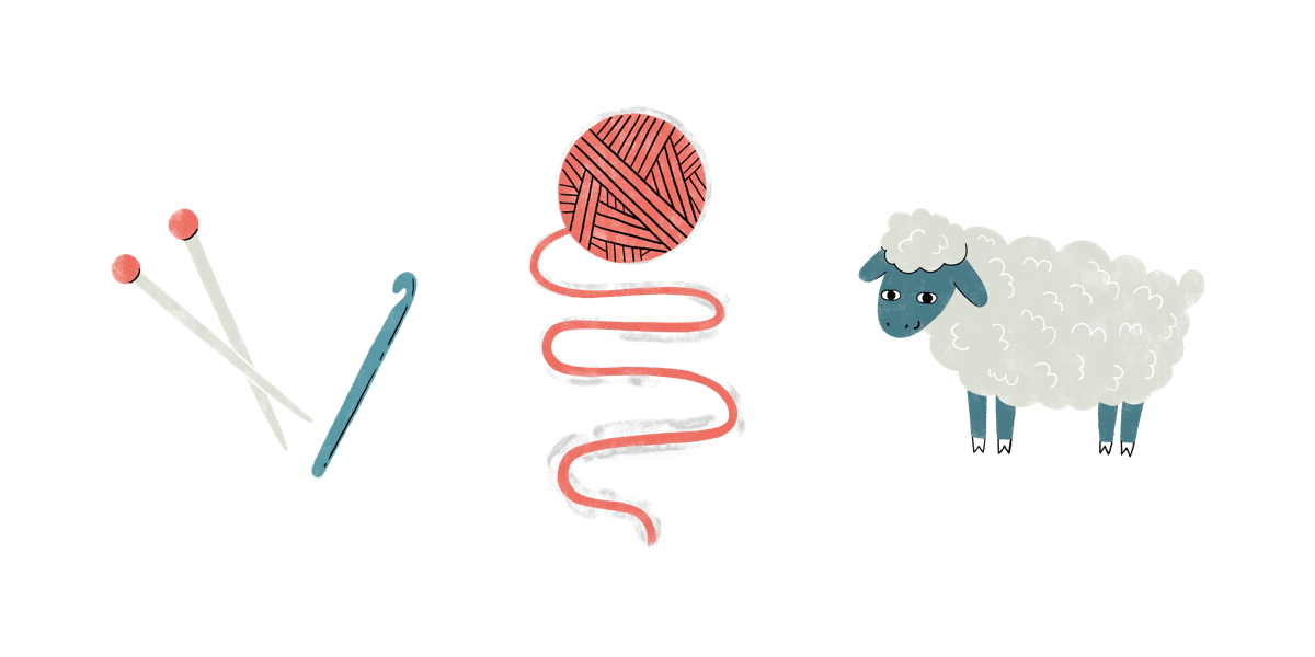
- After 12 years, Jess and Cassidy wanted to move away from pinks and the pale greens to a more gender-neutral, polished look and feel (while still keeping the whimsy alive, of course). The old logo didn't follow best practices for logo design, was difficult to reproduce in print, and many people didn't find it recognizable as a yarn ball. We all agreed that the site needed a fresh coat of paint.
- Cassidy and I are creating a Ravelry design system, which will help us work on big new features together that Ravelers have been requesting for a long time. A design system is a defined set of web components and styles that can be combined in different ways, like building blocks, to create pages and features. Design systems allow for better consistency and accessibility, and enable us to build new things quickly and efficiently. The new design system was going to have to look different from old look Ravelry for a variety of reasons, so we decided to reskin the hundreds of existing pages on the site to visually align them with the new branding and forthcoming design system.
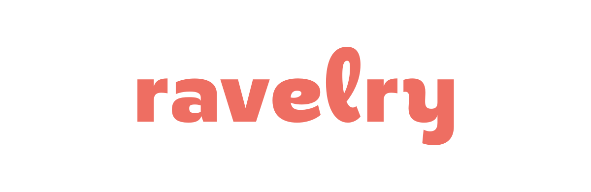
The first thing we did was figure out the logo. Jess found the super-fun typeface, and we loved that the shape of the L reminded us of a loop of yarn. We agreed to keep the logo lowercase, as it's always been, and do a word-only mark so that we'd have the flexibility to pair it with a variety of other visual elements (icons, illustrations, patterns, other colors, etc.). We tried out a bunch of colors and the cinnamon color felt right — it was still a little bit pink without being as "feminine," and it's warm and timeless, just like our favorite fiber crafts. Throughout the logo design process we showed options to our friends in the fiber and design worlds, and everyone provided great feedback and felt good about where we landed. We finalized the logo in April of 2019, and over a year later we still love it!
We also needed a secondary mark to use for things like social media avatars and the favicon. (This is a really common system with logos — for example, this is Instagram's logo, and the little camera is their secondary mark.) We tried a bunch of different approaches but ended up with a simple misshapen circle with the r in it. Like the primary logo, we kept the secondary mark simple so that it could be flexibly used. We affectionately call her "Lumpy" :) If you need to update the Ravelry logo on your website, blog, marketing materials, social media, etc., we have a new page for that here.

We already had our cinnamon color for the logo, and now we needed some color friends. This was the hardest part of creating the new look. There were so many parameters: The colors had to all work with the cinnamon logo color, they had to work with each other, they had to meet color contrast ratio guidelines for web usability, they had to work in both a web interface and on physical items like merch, we didn't want the colors to feel too gendered one way or the other, we didn't want the colors to follow current web trends in color schemes, we still wanted the two main colors to be a shade of pink and a shade of green, and we wanted them to feel bright and friendly and warm. I probably spent 4-6 weeks trying out hundreds and hundreds of color combinations, mocking up site pages and merch, sharing them with the rest of the team, tweaking a hue one point on the color gamut, checking contrast, sharing again, starting over. We actually landed on a totally different scheme for a little while, but when I started reskinning pages we realized it wasn't working, and I went back to the drawing board until we got to where we are.
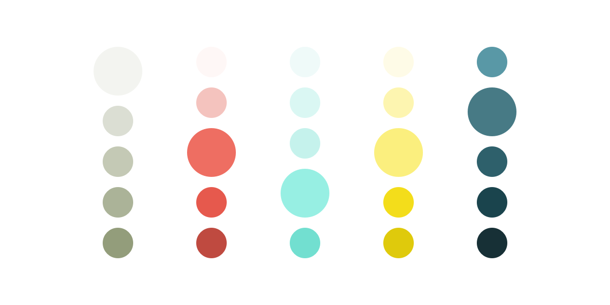
The most challenging color to figure out was the top navigation bar on the website. We knew that we also wanted to keep it a shade of green, but it was really hard to find a green that worked with the cinnamon. I think I tried every green in the RGB gamut before we landed on the very light sage color you see now. The pale green-grey reminded us of linen, and let the logo be the star.
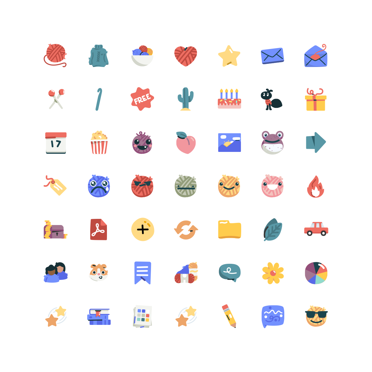
Next we contacted Kirk Wallace and Sara Bicknell to do custom icons and illustrations, respectively. Kirk is an icon designer and illustrator who's local to Cassidy and Jess, and Sara is an illustrator and long-time Raveler. The icons on the old site were pulled from other sources on the internet, so we were really excited to have Kirk create custom ones, especially for things that are unique to Ravelry—your notebook sections, the happiness ratings, etc. He designed hundreds of icons for us, and always took it in stride when we reached out to him because we'd forgotten something. The icons incorporate colors beyond our five main hues, to add little pops of fun and whimsy to the site, and are vector and therefore fully scalable—so while in the current reskin they're 16x16 because that's the size they were in the old look, we're excited that we'll be able to make them bigger as we add and redesign pages.
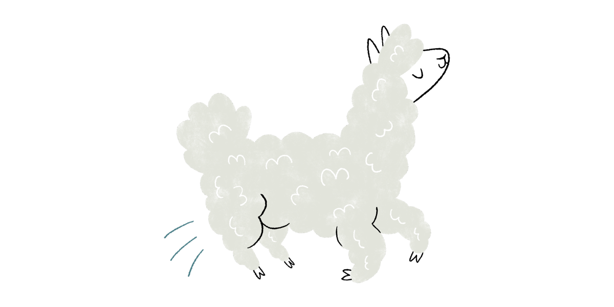
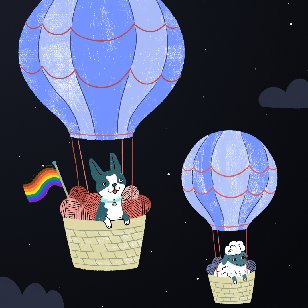
Sara did the excellent work that you see on the login page (she deserves all the credit for the genius yarn balloon concept) as well as several characters and items that you see throughout the site—the illustrations across the top of the Help page, the stand at the top of the MiniMart, and the hilarious Bob on the Crappers page. Her style is so playful and funny, and we're really excited to get all of these characters on future MiniMart items.
As all of the visual elements came together, Cassidy started applying the new look to the site. I can't overstate what an absolute mountain of work this was for her! She had to reskin over 800 individual pages, and went through them alphabetically—she'd check in with us and say "I'm up to Profiles! I'm up to Projects! I'm up to Queue!" and we'd cheer her on. Usually with a site as big as Ravelry, there are dozens, if not hundreds, of people doing the work that Cassidy and I are doing, and I'm still in awe of how quickly and beautifully she was able to do it all.
While working on the aesthetic updates, we also fixed up a bunch of mobile pages and made some adjustments to the navigation: all social pages now live under the Community menu, and your Notebook is focused on your fiber projects. These updates are setting the groundwork for some new features that we're excited to get working on soon. Cassidy also surprised us with beautiful team portraits by the amazingly talented Danielle Chuatico, which you can see on our new About page.
When Cassidy was done, we started testing the new look in waves: First with our friends and family and the mods, then with larger pools of designers, yarnies, LYS owners, and other fiber industry people, then with randomly selected Ravelers who had opted in to beta test. We changed a lot! We edited icons pixel by pixel, pared back dropshadows, fixed bugs, moved things around, changed colors, adjusted sizing. When we felt like we had addressed the common concerns, we decided it was time to share with everyone.
I can't stress enough how much hard work, thought, and love went into the new look. To everyone who is excited as we are about Ravelry's future possibilities, thank you—it makes the thousands of hours we've spent on the new look over the last 14 months worth it! And to people who've shared feedback, thank you too! Now that we've released the new look, my job is to listen, identify common issues, and thoughtfully and thoroughly make improvements that will help the most Ravelers. Ravelry is a huge community and we care about you all so much, and I'm excited to keep working on this big project, together now with all of you. Onward!
