Ravelry's new design launched just last week, and we already have so much to share with you. Today we want to talk about readability and web accessibility, some site news and announcements, post-launch updates and fixes, and a new feature for Pride. 🏳️🌈

Readability
When it comes to Ravelry's readability, we know that the increase in contrast and white space and the change of color palette has been a vast improvement for some while being a degradation for others. For those of you who are having issues with the New Ravelry design, we’re truly sorry that aspects of the site are not usable for you. Your experience on Ravelry matters so much to us, and we're working hard to make our site work as well as possible for all of you. There is no magic bullet for designing websites to accommodate the wide range of vestibular disorders and visual needs, and we are being as thoughtful as possible in our approach and research in order to make the best decisions we can to help the most people.
We are currently conducting a readability survey and have sent it to specific groups of Ravelers with different visual needs. When we have more complete data from the readability survey, some of the post-launch changes we made may be adjusted based on that data.

Web Accessibility
Since early May, we have been using Treo.sh to track changes in our Google Lighthouse Accessibility audit score. This score does not paint a full picture, but it is helpful in making sure that there are no regressions as we write new code and replace old code. It is also affected by photos that do not have alt text (photos only have alt text if the uploader adds a caption). On pattern pages, we saw a drop of 2 points out of 100 on launch day and have since boosted the score by 23 points beyond what Classic has. Again, these metrics can only tell one small story, and some pages are still behind Classic by one or two points, but the goal is to track progress and avoid regressions.
There is still work to be done, and this is part of our phased approach. We are being deliberate about making real improvements to the accessibility of Ravelry. As Livia wrote in The Story of the New Look, the goal of this phase was to retain our existing HTML while visually aligning the look of Ravelry with a new design system and new components, which we are writing from scratch with accessibility as a core feature from the start, as one should be doing in 2020.

Other News
We are excited to welcome a whole new flock of fiber artists to Ravelry! Since we launched our new design, signups have more than doubled (a 103% increase) over the same period from last year. Correction: we forgot that signups were temporarily closed on June 23rd last year. After factoring that in, the number is a 73% increase in signups and not 103%. While June is traditionally the slowest month on Ravelry, we are also on track to have the busiest pattern sales month of any June ever. We're so happy to see our community supporting Ravelry designers!
Every day since the launch of the new design, Sarah (onestitchshort) and I have been active in our For the Love of Ravelry forum: reading and tracking feedback and bug reports, posting to share our team's daily updates and announcements, and assisting people with questions. The two of us are going to continue to help folks in that venue, but we also realized that since the majority of Ravelers don't use the forums, we are missing out on the chance to connect with most of you. Going forward, we will make sure to share highlights of our site updates, announcements, and fixes here on our front page and blog. We'll always have more things happening behind the scenes than we are able to post about in detail, but we're looking forward to using this space to share what we've been working on with more of the Ravelry community. To that end: let's get started, because we've been busy!

Post-launch Updates and Fixes
Since we launched Ravelry's redesign last Tuesday, we've been working to make changes, fix bugs, and adjust elements of the site based on feedback from you.
Here are some of our updates from this past week:
Our login screen is now still; when not logged in, you can press the play button (at the bottom left) to see the balloons and clouds animate, and pause it again whenever you like.
If you participate in our groups and forums, you probably noticed that reply button formatting, borders, dividing line, reactions, line height and more were changed to provide a better reading experience.
In your settings (also linked through your Profile dropdown), there are two new options in the accessibility section, and available for everyone using New Ravelry:
- You can toggle black drop shadows on and off site wide.
- You can choose whether text on Ravelry displays as Inter, your system font, or Helvetica, which data shows is a very legible font for those with dyslexia.
Just this morning we improved Advanced Search for screen readers, beyond what the Classic site provided. If you have feedback on using a screen reader with Advanced Search, please get in touch!
We launched a new bug reports system for the new Ravelry that will allow us to collect problem reports much more efficiently (and thus, implement fixes more quickly!). You’ll see the option to report a bug in the Profile drop-down menu in our new design. Including your email address is optional, but if you do choose to include it, we can follow up with you if we need more info and you may also receive a notification when it is fixed (we don't announce all fixes). If you have a bug to report while using in the Classic site, you can do so with our monthly Classic Bug Reports thread on the For the Love of Ravelry forum.
We created a new form for feedback about Ravelry's new look; you can fill it out here! it is also linked on the front page so that the majority of Ravelers who do not use the forums and have been contacting us via other means will be able to easily access it. This feedback form, rather than the forum threads, is how we will gather and track feedback about the New Look change going forward. If you have additional feedback or questions about Ravelry's new look or the survey itself, please feel free to email us.
We added an option to change back to the Classic Ravelry site; you'll find the toggle in your Ravatar/Profile menu (the toggle to switch back to our new/current Ravelry will also be in the Ravatar/Profile menu while in Classic view). We will not make changes, updates, or add new features to the Classic site, so it will retain the same look and browsing experience that folks are used to. If you utilize the Classic site, we set a cookie so that the specific device that you used Classic on will get the Classic login page. The cookie, and thus the setting, is long-lived, but your browser cookie settings may override this. 92% of active Ravelers are using our New Ravelry site, and we're working to keep improving it so that it is the optimal Ravelry for 100% of you soon. We have committed to giving six months' notice when it is time for us to retire Classic.
Some often reported bugs that were fixed:
- On mobile, there was a visual glitch triggered by using your browser’s back button after navigating with the sidebar. It’s fixed.
- There was a bug related to photo cropping and centering that has been fixed so you can once again show off your photos just how you'd like.

Happy Pride!
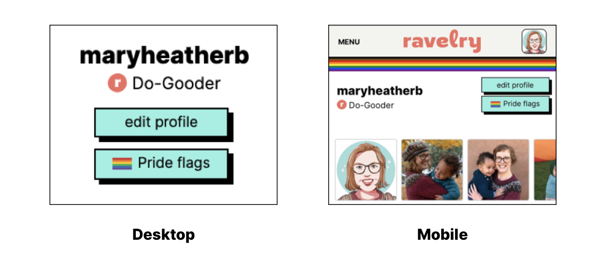
To celebrate Pride this year, we made a new feature that allow you to select and fly a flag to add as a banner at the top of our Ravelry Profile pages. You can find the option to choose your flag just under the edit profile button on either our desktop or mobile sites. This feature is available on both our standard/New Ravelry, and the Classic site.

Our little team at Ravelry is looking forward to this next phase for our site and community. From creating new and long-wished for features, greatly improving accessibility, and developing more efficient ways to openly communicate with all of you, we have such great things planned and know that together, we're all going to keep building something amazing. Thank you for being here.


